What do women want from a phone? It used to be thought the answer was a phone that was pink. Now it's a phone that works.
That was pretty much the conclusion of a Powerpoint presentation shown to HuffPost by Nokia, at its London offices recently.
The Powerpoint was based on independent research by IDC, about which handsets and functions female smartphone users prefer to men. But among the findings - 71% of women prefer a choice of colours compared to 41% of men, for instance, while more young women use their phones for browsing than chaps - there was also a symbol indicating 'women'.
It was perhaps unfair for us to point out - as we did - that the symbol was... pink.
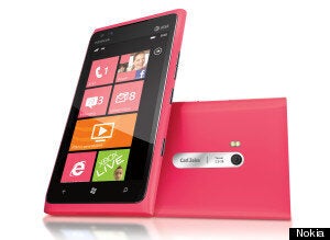
"Because Nokia makes a blue Lumia 800 and a pink Lumia 800..." we said, hesitating. "You can see where we're going with this..."
"It's magenta," interrupted Nokia's VP of smartphone user experience Nikki Barton. In a nice way.
"It's pinkish," we countered.
"It's magenta."
"I'm just colour blind then. But you can be cynical about this stuff…"
Barton jumps in again.
"Actually the colour story that we have is not blue or pink. It's CMYK. We took the purest colours there are for prints and we're using those along with white.
"The cyan uses a pure cyan colour that we can only get in one place in the world. It's that purity of the colour."
Ah. We should have known. For if there is one thing Nokia is doing right - or at least doing thoughtfully - at the moment, it's design.

For all the discussion about its precarious financials, and its global decision to move from its own smartphone platform to Windows Phone 7, Nokia's Lumia 800 and 900 smartphones have been at least refreshing, if not revelatory.
When smartphones are almost universally white, grey and black, poorly designed or else just rapidly ageing, Nokia's handsets are made out of a single piece of injection-molded polycarbonate plastic, into which colour has been poured before being set and machined.
Unlike other phones where the colour is basically painted on, Barton said, with Lumia devices the pink - sorry, Magenta - runs through the entire shell of the device.
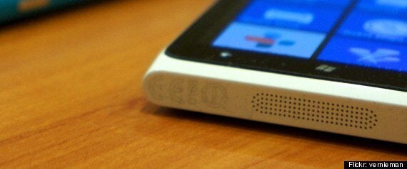
Barton also points out the various design details that help the minimalist design still appear distinct. The individually-milled speaker holes, the concentric position of the audio jack and the matte feel of the case. Advertising people would say it 'begs to be touched'. But like similarly designed (and coloured) tech - for instance the Jawbone Jambox - it kind of does.
They've also won big plaudits - most recently picking up a joint gold award at the Henry Ford Museum and Industrial Designers Society of America's IDEAs.

Above: each of the speaker holes in Nokia's Lumia 900 are individually milled to prevent dust getting inside
So is it true that, now Nokia's phones aren't running their own OS, industrial design is even more important?
Barton says no, arguing that both are, and have always been, part of Nokia's DNA.
"I just think it's important to get it right, to make it work for people," she said. "Nokia has a heritage of being easy to use and being very human technology and that's what we've tried to do with the industrial design. So although it does look very advanced, when you pick it up and feel it, it feels incredibly human to hold."
Likewise, Barton - and Nokia - don't agree with the supposition that by not leading the market for smartphones (and for all their awards, they're nowhere close) they can be more creative. But they are aware of the need for their phones to make an impact, now that most independent observers estimate it's only got a few more big rolls of the dice to find momentum to combat the big smartphone players in Samsung and Apple.
"It's very, very different from what's gone before," Barton said, picking up and admiring the various Lumias and 808 PureViews which are arrayed in a CMYK ribbon around the giant boardroom desk.
"But that is because of the importance that Nokia puts around design and it's something that the design team have always been focused on."
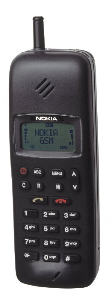
Certainly it's true that Nokia has always experimented with design, sometimes to the point of absurdity, even when it was the market leader (see above).
But with phone hardware plateauing to some extent - most phones now are basically giant touchscreens with some 'stuff' around the sides and back - it's harder to be so creative. Barton points to the harmony of software and hardware as one example of the industry continuing to improve. But in another sense design language is becoming almost bizarrely esoteric. When Samsung introduced its Galaxy S3 with the tagline 'designed for humans', it was obtuse - and not just because of the obvious retort 'well who else was it designed for?', but because it appeared to place it in competition with Nokia not over patents or features, but ownership of a philosophy.
IDC and Nokia's research does indicate people feel more connected to their devices. But, cynically perhaps, HuffPost raised an eyebrow at that finding:
"But if you go out in the street and ask someone that question," we said. "“Do you feel personally connected to your phone?” you know that people will say no."
"I think people would say yes actually," said the Nokia rep at the interview.
"Maybe I'm being cynical but I think people would say no," we replied.
"If you have your phone in your pocket, it's close to your body, it's probably the only piece of technology you have that close to you."
Barton agreed.
"From the immersions and the questioning that we've done in the street, people are feeling more and more emotionally connected to their phones," she said. "And they personalise them as well. The Lumia and the Windows phone, Metro UI, means it's very, very easy to personalise."

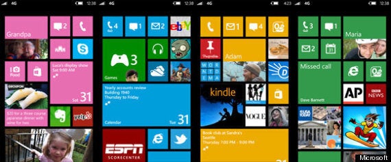
Above: Windows 8 start screens - the new OS will launch in the Autumn, though not on existing phones
Ah, Metro. The Windows Phone interface is undeniably handsome - and will improve on the release of its next big version, due in the autumn - at least to those users who buy a new phone (Windows Phone 8 isn't coming to existing handsets).
But does running Windows Phone reduce the amount of difference a user experience exec like Barton can actually make?
Barton says that not only does Nokia makes its own apps - its mapping work is particularly lauded - its design teams work closely with each other. She adds that Nokia also works closely with Microsoft, to customise elements of Metro and make sure it works with the devices:
"We've spent a lot of time with Microsoft making sure that something which seems quite simple, which is making the colour of the tiles and the' colour of the themes complement the hardware and the ID."
Indeed, Microsoft's recent announcement of its Surface tablet notably used the same pink and blue (sorry, cyan and magenta) that Nokia has made the cornerstone of the Lumia range.
And while, for the record, we asked about the chances of a Lumia Windows 8 tablet, we didn't get very far:
"We haven't made any public announcements about tablets," Barton said.
"It would look good though wouldn't it?" we asked, smiling.
Nothing.
But what - as a designer - is Barton inspired by?
"My home has got a lot of technology in it but I don't want to sit and use it the whole time," she said. "I want it to work for me.
"I was looking at the IDEA awards last week and there's a fantastic design for a washing machine, a pedal operated washing machine, for women in the developing world, where you can pump the pedal and you sit on it and the weight of sitting on it makes it more efficient.
"And it looks beautiful as well but not in a flashy, super-design-focus way. It looks absolutely beautiful and it works well.
"I'm into things that work well for people and really can change people's lives."
Of course, whether or not Nokia's phones will still be changing lives in 10 years will come down to more factors than just design. The smartphone war is fought on many fronts - price, software, ecosystems, fashion, ideas, specs. Design is just one battle in that war. But you can't fault Nokia for effort - or vision. Because right now, on that one front, they're arguably winning.
So what's next?
"I really want to get the eye contact back," Barton said. "I think we’re at a stage now in technology design where that is becoming more possible… Whether it’s gesture or voice or those things combined. It’s allowing the technology to work for you and not be driven or told what to do by the technology. For me that’s what it’s all about."
