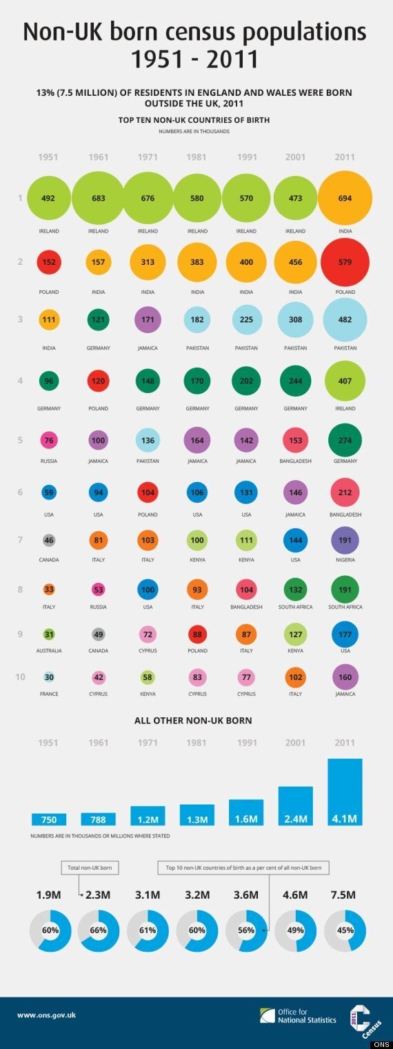
This graphic shows the changing face of Britain as recorded by every census since 1951.
It shows how people from Ireland were accounting for the most new arrivals every year until 2011, when India took over, followed by Poland and Pakistan.
The numbers coming from Ireland have stayed roughly constant since 1951, the Office for National Statistics showed.
STORY CONTINUES BELOW:

Source: Office for National Statistics
It also revealed that the number born overseas in the UK had quadrupled in 60 years, from 1.9m in England and Wales to 7.5m by 2011.
The percentage went up from 4.5% to 13%.
The ONS said the reasons for migration to the UK were "complex", but included factors like war, political instability and poverty and well as the attraction of employment and education opportunities.