Everyone knows the most important thing when creating a successful space agency isn't money, rockets or a plan to reach Mars - it's a funky logo.
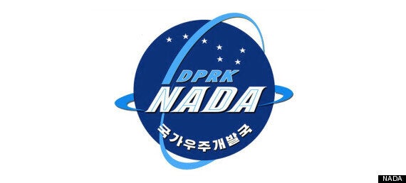
So behold, here is North Korea's latest effort to celebrate one year since they launched the National Aerospace Development Administration.
Unfortunately no one appears to have informed them of what 'NADA' means in Spanish.

Lovely
It reads...
The emblem of the NADA was recently instituted, which represents its character, mission, position and development prospects.
Seen in the lower part of the globe-shaped dark blue emblem are white-colored letters "Kukgaujugaebalkuk" (National Aerospace Development Administration) in Korean and in its upper part light blue-colored letters "DPRK" with the Great Bear above them. Printed in its middle are white-colored letters "NADA" in English.
Two light blue-colored rings intercrossing the emblem symbolize satellite orbits.
The Great Bear reflects the will of the space scientists of the DPRK to glorify Kim Il Sung's and Kim Jong Il's Korea as a space power.
Glorious. And North Korea's rural population must be incredibly happy all this money is being spent on a space programme while they starve to death..