Ever wanted to be confronted with the crushing reality of just how much travelling to work costs IN ADDITION to the property prices of areas you skirt through but can only dream of living in?
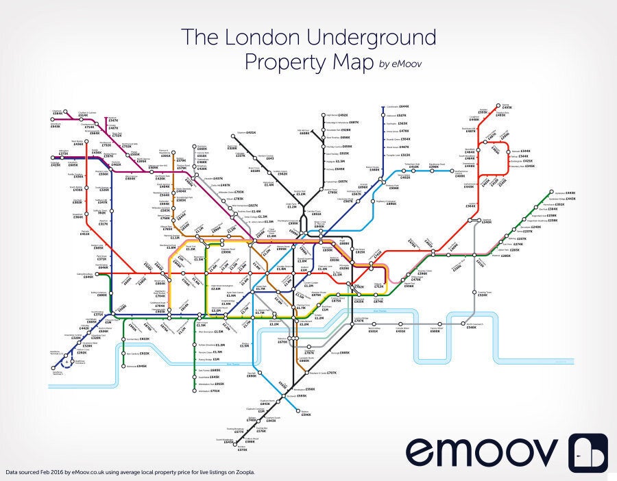
Well look no further. The good folk at eMoov have created every commuter/ Londoner depressed by the city's spiralling housing costs nightmare with their 'property price tube map'.
That's a map of the capital's transport network showing just how much buying an average-priced property at each stop will set you back.
So wave farewell to those dreams of owning your very own 'Château de Chalk Farm'. Or indeed anywhere that isn't a 'Harry Potter-style' cupboard under the stairs room for £500 a month.

Click here to view a zoomable version of the map
The headline figure is that an 8-minute longer journey on the Metropolitan Line would save buyers £1 million. That's if you fancy relocating from Finchley Road to Wembley Park a stop further.
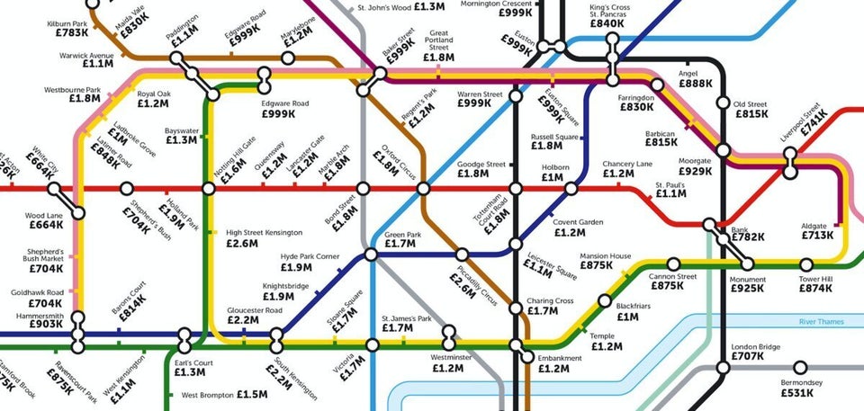
The map also shows that with an average house price of £1.2m, no Tube station in Zone 1 offers a property for less than £500,000. But there are five stops where the average house price hasn’t yet hit the £700,000 mark.
At £536,000, Aldgate East offers the ‘cheapest’ property prices in Zone 1, joined by Lambeth North (£660k), Borough (£665k), Waterloo (£670k) and Vauxhall (£690k). So get your moving goggles on, before those pesky oligarchs move in, folks.
Perhaps unsurprisingly, East London accounts for the majority of Zone 3’s cheapest tube stops. The zone has an average house price of £595,000, with East Ham coming out on top as the most affordable at £274,000.
Keep scrolling for some close ups of those North, South, East, West and Central London property prices to help you cry yourself to sleep at night.
SEE ALSO:

