
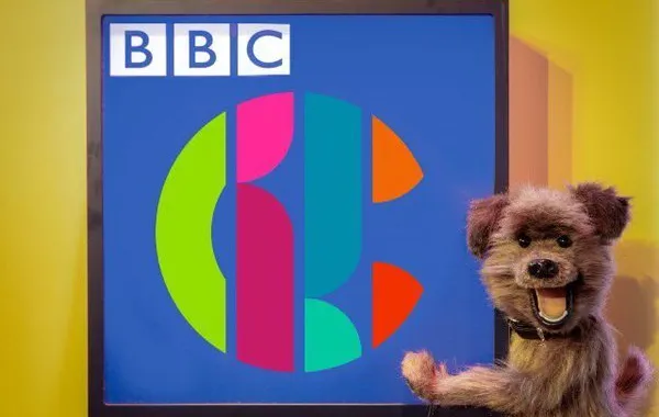
The new logo for the BBC's children's channel has been roundly trounced on social media, as the channel's own boss admits it "doesn't scream 'children's TV'".
The new design for CBBC includes shapes which echo the recently-revealed logo of the now online-only BBC Three.
Perhaps unsurprisingly, unfavourable comparisons between the two were quickly made.

And in comments marking the launch of the new brand, even CBBC's controller conceded the new brand's association with kids TV isn't obvious.
Cheryl Taylor writes: "Our new logo is not overt, it doesn’t scream ‘children’s TV’ but its various iterations are fun and unpredictable and have broad appeal."
Taylor adds that the new logo would be appreciated by older children as much as it would be by younger viewers.
But nonetheless, adults on Twitter were scathing.

The new logo is, for some, too similar to 'W1A' - the fictional sitcom based on more bizarre aspects of life at the Corporation.
In the show, annoying 'brand consultant' Siobhan Sharpe, played by Jessica Hynes, advocates re-branding the BBC by not mentioning its name.
SEE ALSO: