What's the best story you've ever been told? What's the best piece of fiction you've ever read? What is it about the memories of those that have made them stick in your mind? Defining what a story is and why they have impact is very difficult. At its heart a story has characters, a narrative, tension, and a resolution. What if you could take the key aspects of storytelling and apply them to data?
Charts and interactive dashboards are now established as familiar and effective ways of dealing with data. However, when exploring an interactive dashboard you may or may not find the facts that are most relevant to making the right decisions or reaching the right conclusions. Imagine I wanted you to know something specific about a set of data, and imagine I could hold your hand and guide you through it. If I could do all of this visually, in a narrative, then I would be telling a story with data.
Data storytelling has many useful applications. In business, it can be used to drive change. How often have you had to go to a meeting to convince a manager or an executive to see things differently? Imagine leading them through a narrative based on hard data and getting them to reach the conclusion you want them to reach. Storytelling like this allows you to lead people through data to a single end point.
What does a data story look like? This question is as hard to answer as "what does a written story look like?" I'll provide a couple of ideas. Maybe a story is like pages of a book or slides in a presentation. On each page is a picture (a chart) and annotations explaining that stage of the story. As the reader turns the pages, or clicks to move on, the chart changes and a new point is made. Along the way, the reader can interact and explore their data in order to gain more context where necessary. When the reader reaches the final page, the conclusion is clear.

Or maybe a story is an animation of a single chart. As the story plays out, data reveals itself. With each revelation there might be annotations or other explanatory items. By the end of the animation, the full picture is known and has been explained.

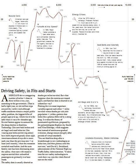
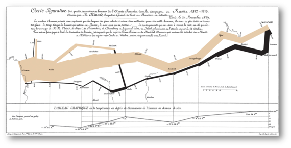
A story can even be contained in a non-interactive chart, if designed well enough. As long as the reader can understand where to start and how to progress, it can tell an effective story. Perhaps the most famous of these is Charles Minard's chart telling the story of Napoleon's 1812 march to Moscow. In this, the army's advance and retreat to and from Moscow is shown, as well as the huge loss of life along the way.

Should every data visualization be told as a story? No. There are many circumstances where stories are not necessary. Imagine I'm an investor, tracking the financial markets each day. In this example, I'm an expert in the data, and I am tracking things to spot exceptions, trends or problems. This scenario would not need a story; it would need a chart that I can glance at and immediately see what action, if any, needs to be taken.
Data storytelling brings new opportunities but does not replace old ones. If you work with data, what stories could it tell?
