Andy Cotgreave, social content manager at Tableau Software, explains how interrogating data sets can be so easy that you might only need one finger
How much data do you see every day? Whether it's wading through lines of numbers on spreadsheets at your office or sitting at home comparing the batting averages of England's cricket team, data has become a staple part of our daily lives. Despite this, very few of us have the tools that permit quick, effective data analysis. What many people fail to appreciate is that there's no need to spend hours wading through pages and pages of voluminous data. Indeed, sometimes one finger is all you need to be able to explore and analyse the data in your life!
Not convinced? Let me give you an example. I was recently privileged enough to recently deliver part of the Keynote at Tableau's European Customer Conference in London. My section was designed to demonstrate how it is possible to explore your own data using an iPad. Not only was this a great thrill, but also a challenge that was all-consuming in the weeks immediately prior to the conference, as I'm sure you can imagine. .
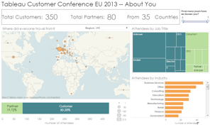
In my demo, using an iPad, I was sharing charts about the conference attendees. I had a map of where they'd come from, and charts breaking them down by job title and industry. I was able to interact with these; I could use my finger on the iPad screen to explore, filter and drill down. That in itself is amazing, and I often feel that many of us are guilty of taking applications for granted, especially ones that free us from our desks. But that wasn't what people told me afterwards was the most amazing thing. So, what was?
Well, imagine if you you're interrogating a data set and have new questions that aren't answered by the charts on your iPad. What are you supposed to do if you are away from your office? Every day, millions of us spend time out on the road. Shouldn't we be able to ask these basic questions, regardless of whether or not we are sat in front of a PC? Of course we should! This is 2013, after all, and anyone, anywhere should be able to ask data-driven questions.
It was this point that I truly began to appreciate the power of the demo that I offered. At first glance, there were questions the charts didn't immediately answer. And yet, I was able to answer them, using just one finger, on my iPad.
"Which cities did people travel from?" I asked, as I edited the map and added new data fields.
"When did everyone register?" I questioned, building a new chart that showed registrations over time.
"When did we hit our conference attendee targets?" I enquired, taking the time series analysis and creating a running total of conference registrations.
All using only my index finger!

Of all of these, the last, the running total, held my attention the most. Many people are stuck with cumbersome spreadsheets or complicated tools that make every day business questions incredibly complicated to answer. Is it easy to make a running total in your BI tool or spreadsheet? What I'd done, on stage, was answer this simple question with my index finger, on a tablet.
Without stopping to reflect, I had demonstrated something still dreamt of by millions of frustrated people. They do not want to have to juggle with complex products, or build elaborate queries; they just want answers to basic questions. The new generation of software tools solve this problem. They are designed to focus on how a user works rather than the technology itself. Once the technology gets out of the way, users can do more with their data, more quickly, and more efficiently than ever before.
