Infographic.
A word largely unknown in 2009 is now something that PR firms are filling my inbox with daily. They are all over social media, and they sneak up on me anywhere I might expect a picture.
For me, the use of an infographic says one thing above all else
"We have some information that we want to keep secret from blind people"
I'm unsure why the makers of infographics dislike blind people so much. I'm equally unclear why people are keen that blind people are left unaware of, for example, the fact that Russia produces a lot of raspberries.
The graphic that prompted this post was this one.

It's an infographic about disability, that includes for bonus irony points the international symbol for blind people. Someone made a infographic that is intended to portray the difficulties that disabled people face on a regular basis and at NO point did anyone involved wonder about it's accessibility. I've emailed the company a couple of times and rang them a couple more over four weeks but nobody has been available at all to explain it to me.
The second thing that is difficult about inforgraphics is that, alone of many modern technology and cultural artifacts - they make facts more difficult to check. Because it's suddenly difficult to copy and paste the facts and figures into Google far fewer people do it, and many more misquotes, out-of-context figures, and blatant lies are allowed to slip through.
Let's take the opportunity here, and look at the scientific background of this infographic. All of their numbers are from: https://www.gov.uk/government/publications/disability-facts-and-figures/disability-facts-and-figures, which is a 101-character URL the user is expected to read from an image into their browser (The other 'source' is the stock photography site the images are from).

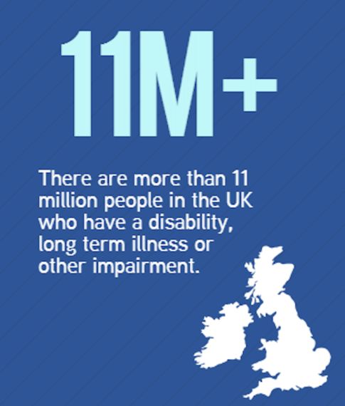
Are there 11million people in the UK with disabilities? There's actually 11.6, which is fair - but the image isn't just of the UK, it includes Ireland, who have 600,000 of their own. I know it's pedantic but we're warming up here.
Next up:

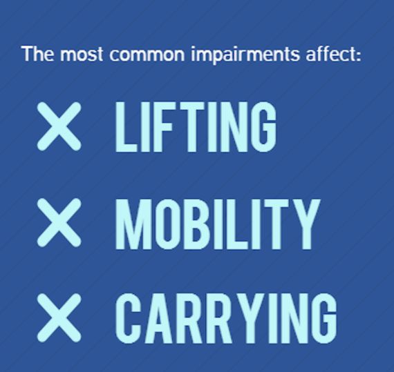
You might be wondering why 'Lifting' and 'Carrying' are two separate categories given they are effectively the same thing. The original source would agree with you. Their top three are "Lifting/Carrying", "Mobility", and "Manual Dexterity" ("Continence" and "Communication" are the next two down). I assume this is an accident, it's not like this formulation is closer to the interests of a company than makes stairlifts for the elderly or anything.

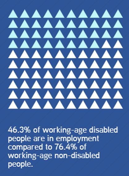
Yes 46.3% of working-age disabled people are in employment compared to 76.4% of working-age non-disabled people, but why are you showing a graphic that has 62 things out of 100 coloured in (or 38, depending on if white or blue is intended to be the original) ? What am I missing? How do you get from either of those numbers to 68?

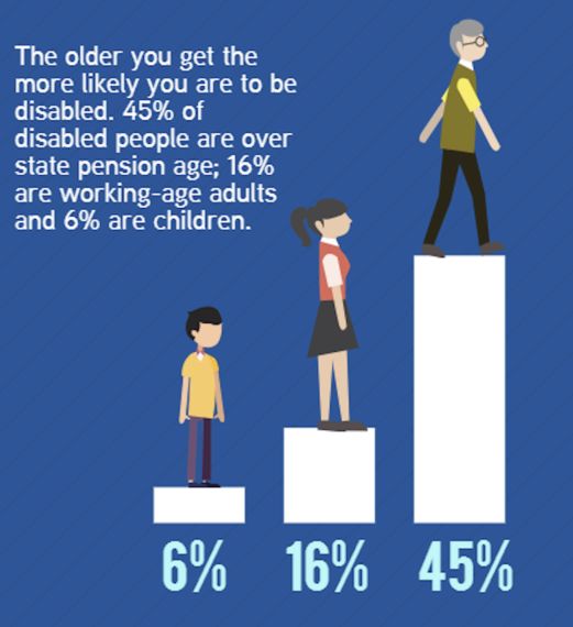
You might be wondering about the 6+16+45=67, so where are the other 33%? Are they people yet to be born? (The numbers are actually closer to 7%, 46%, and 44% - there are more disabled people of working age, largely due to improvements in health and social care). I assume this is an accident, it's not like this formulation is closer to the interests of a company than makes stairlifts for the elderly or anything.
Yes, we're shooting factual fish in a barrel, but there is a clear point. If you are going to try and promote your business and make money by informing the public about issues, then go for it - sponsoring research, donating money in the form of large cheques in front of photographers - a lot of good is done that way. But if you are going to do it, do it right, check your sources, make sure that the 360,000 people in the UK registered as blind or visually impaired can find out about it as well and put it on a webpage.
Because here's the third thing about infographics that companies should avoid - when you put data on a webpage you have control over it and you can fix errors (I have to do it regularly - I'll probably have a few on this post) but when I fix them they get fixed. But if I take a photo of it it and share it then it's out of my hands and all over the net - and suddenly I've lost control of my message.
Joe Reddington writes about, talks about and researches disability. Sometimes he writes about things like fact checking.