SAMA Asian Kitchen first opened its doors in November 2013, landing right in the heart of Wimbledon's high street. The Southeast Asian eatery didn't have a name when I began work on the project, so I guess you could say I was working on it since day dot. After going back and forth between countless names, we all loved the idea of sama sama which is Indonesian for "you're welcome", and to give a bit more speed, we cut it down to simply SAMA.
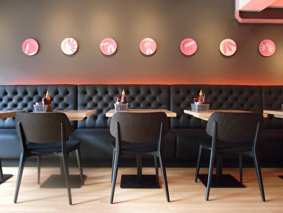
Due to the name decision spanning months, the styling of the brand had already taken shape prior to the name being set in stone. On one of the moodboards, I had been playing around with the idea of rice grains making up patterns and had initially put it down as a wall covering concept. When reworking the formations, the grains could easily be taken into an 'S' - making the final logo you see today. The pattern is again seen in abstract applications around the store, such as on the bespoke plates displayed across the wall.

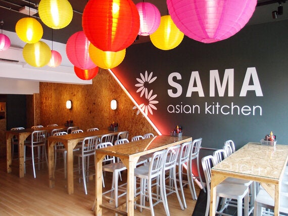
Having worked on many interiors for the Tossed brand, I wanted SAMA to have a very different feel, something darker and with somewhat of an edge to it. As this was the first time introducing the world to this brand, I aimed to make a statement in the store. I opted for a severe diagonal to cut through the wall, demonstrating the blend of traditional and contemporary. The line cuts through the logo, dividing the noise of chipboard and the smoothness of a simple deep grey.
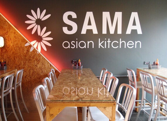
The colour palette is very muted; mainly using light wood, black, white and accents of pink. I wanted to give an industrial element, which can be seen in the neon glow coming from behind the chipboard sections. These transform the environment from day to night, bringing a warmth in the evening and glowing through the windows - as though a spaceship has landed on the high street. To add an element of colour and give a nod to the traditional, lanterns fly overheads to guide the guest down through the restaurant.
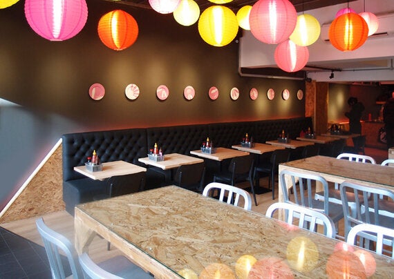
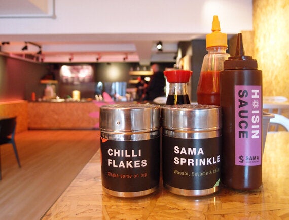
To keep an informality in the space, I wanted to keep elements of street food and opportunity to let the tempting ingredients do the talking. On the main counter, the food is displayed in bright cookware, giving off wonderful aromas and being very visually pleasing to the guests. On each table, I created baskets filled with a menagerie of sauces and sprinkles, branded with their own identity, while still falling under the overarching SAMA style.
Overall this was a very interesting project for me to work on, and a real departure from many of the interiors I have done in the past. The final result stands out in the Wimbledon landscape and lives up to my vision of a traditional meets futuristic dining experience.
