It's estimated that one in 10 people in the UK suffer from some form of dyslexia, but reading difficulties for dyslexics could soon be a thing of the past.
A font specifically designed to help dyslexic people differentiate between letters has been created by Dutch graphic designer (and dyslexic) Christian Boer.
Unlike other readers, dyslexics have a tendency to rotate, mirror and swap letters, making it difficult for them to comprehend what they’re reading.
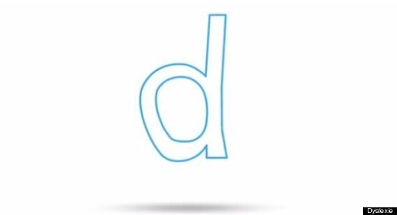
Boer's font, named Dyslexie, emphasises certain characteristics of letters to make them stand out.
For example, bolder bases on Dyslexie letters should prevent a dyslexic from reading a 'd' as a 'b'.
Dyslexie letters also exaggerate the height of tall letters like 'h' and have a slight slant, making them easier to recognise.

Dyslexia can be challenging for children, especially before it is formerly diagnosed.
Blogging for HuffPost UK Lifestyle, Anthony Byrne, CEO of Product2Market.ie recalls his school days: "I remember in school the learning of non-phonetic words really was my biggest challenge.
"Trying to remember a sequence of letters without the word's sound for direction always stumped me.
"I had a list of words that just for some reason I couldn't get into my head, despite my greatest efforts to learn them by rote. I frequently flunked spelling tests and realised as a young man, I had to find away around the problem," he writes.
Dyslexie aims to help people like Byrne in school and beyond.
The font is available online for a variety of systems and devices and is on display at the Istanbul Design Biennial until December 14 2014.
H/T: Laughingsquid.com