BBC Three has unveiled a new logo as the channel prepares to leave our TV screens and exist only online.
The rebrand, which features two 'I's and an exclamation mark, has been tipped to entice younger audience into following the channel's move to an online-only platform.
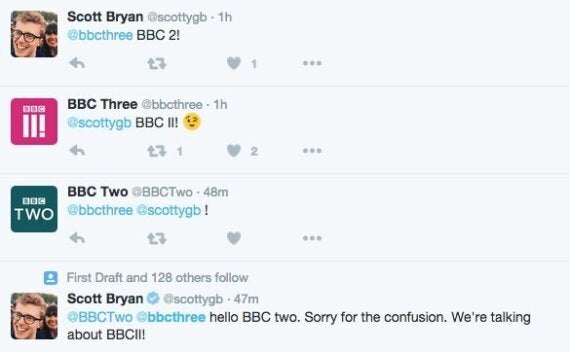
But it has incensed social media users, several claiming that the new logo now looks instead like a replacement for the eight-year-old 'BBC Two' emblem.
Leading to this beautiful exchange...

Others drew a close parallel with the announcement on Monday morning and a scene from satirical BBC series 'W1A', which parodies a similar BBC logo relaunch.
The scene features two staff from a marketing agency unveiling a new logo for the corporation, replacing the letters 'BBC', a longstanding feature of the channel's brand, with a series of bars.
But while BBC bosses did get some stick for their move on Monday, they were safe in the knowledge others were glad it could have gone far worse - and didn't.
Defending the rebrand in a blog post on the corporation's website, BBC head of marketing Nikki Carr branded the new logo "striking" and hit back at comparisons to 'W1A'.
"Thanks to W1A we're cursed at the BBC when it comes to marketing and I don’t want to come across all Siobhan Sharpe," she wrote in the article published on Monday.
"What is most striking is the new logo and the fact it doesn’t actually say three. It’s easy to belittle the importance a logo has in supporting a brand, and I'm sure the usual critics will have their say - 'It looks like Adidas', 'it looks like a hamburger menu icon,' 'it doesn’t even say three', 'are they Roman numerals' – but If I'm being honest I’m not worried.
"Some people are resistant to change and we wanted to be bold and create something that looks forward and will be around for years to come."