"Lost time is never found again." - Benjamin Franklin, 1758
Time is precious. In analytics we not only want to see what's happening over time, we want to get insights from this data as quickly and efficient as possible. How can we chart time in order to get the most out of it?

When we think of charts showing time, we normally think of a basic line chart. We looked at all the charts on Tableau Public to see how many show time using a line. It turns out that over half of them do.
However, there are so many more ways of looking at time, and each can reveal something that a simple time series will not. Changing your chart type allows you to cheat Franklin's quote above: by switching the chart type, you can discover time-based insights that would have remained lost.
Imagine if you could create a different view of time as quickly as you could drag and drop your mouse around a screen. Instead of taking 5 minutes to build one chart and being stuck with one insight, you'd see all possible insights in a short amount of time. What time trends is your data hiding from you?
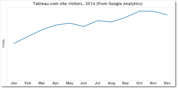
Consider for example, the simple line series above. It is showing visits to my company site throughout 2014 (the data is from Google Analytics and I've hidden the actual values for commercial reasons.) It's pretty straightforward, showing that visits rose steadily throughout the year with a bit of a dip in December.

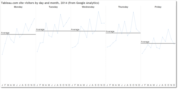
But we might want to tease out more insight. What if we want to know the trend of visits on each weekday? In that case, a cycle plot works. Each line shows visits for each day, broken down by month. The horizontal line shows average visits per day. We now see something the basic chart didn't show us: Monday and Friday are days of fewer visits to tableau.com. Also, we see peaks of visits more clearly - we get more visits in the final month of each quarter. That's cool - we couldn't see that with our basic line chart.

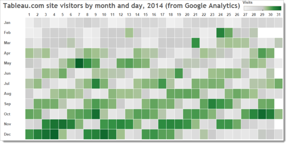
To take this even further, we could try a highlight table. This is a really simple view that shows the annual trends very clearly - days are along the top and months along the side. You can clearly see the overall trend: the number of visits grew throughout the year. You can see the weekly cycle: weekends don't see as much traffic as the weekdays. And you can see really granular detail for individual days - why was March 21 such a peak day? We wouldn't spot that in a regular line chart.

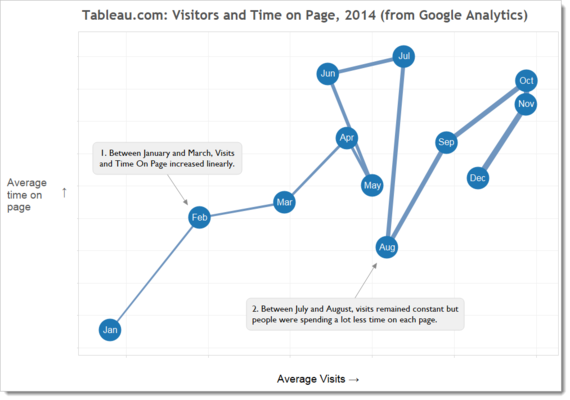
I'll finish with one of my favourite views, a connected scatterplot. This isn't the most common chart type but it is very powerful when you want to compare numbers. In this case, I want to see the changing relationship between Visits and Time Spent on Page.

You can see that in the middle and end of the year we saw a big drop in Time on Page while Visits stayed the same. This is really valuable insight for our marketing team: was the content we posted that month less interesting?
You could keep going: bump charts, slope charts, small multiples, etc. But which is the right one? There's no definite answer to that. The right chart is the one that reveals the insight you or your audience need. As it's impossible to know what that is, the concept of "the right chart" is one we should abandon for good.
The real power of visual analysis is to be able to see all of these chart types quickly and simply. Most people have one shot at getting a decent view of the data. Why? Their tools are cumbersome and visualizing data is hard. Or their tools ask them what type of chart they want to see before they can do anything. That's very restrictive. Flowing between chart types should be instant and natural. What if we could drag and drop time around a canvas, and each time we move it we see data in a new way? Imagine being able to see 25 different views of your time-based data in as many minutes. If Franklin could have done that, maybe he wouldn't have been so worried about losing time.
