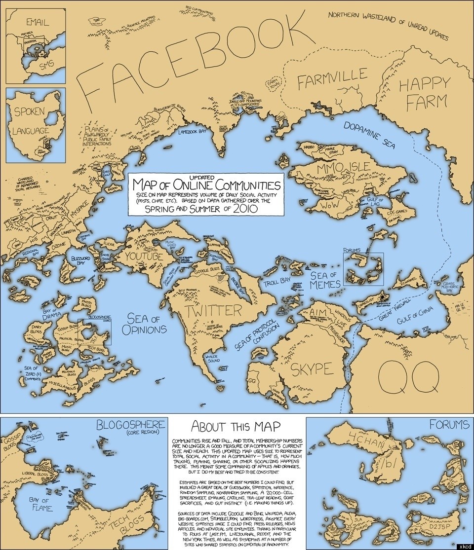
XKCD's Randall Munroe, who created a popular, just-for-fun, pseudo-scientific Map of Online Communities in 2007, has revamped his previous infographic. The latest edition, called the Updated Map of Online Communities, reflects (among other information) data from spring and summer 2010.
"Communities rise and fall," writes Munroe, "and total membership numbers are no longer a good measure of a community's current size and health. This updated map uses size to represent total social activity in a community--that is, how much talking, playing, sharing, or other socializing happens there."
The 2010 estimates "are based on the bet numbers I could find, but involved a great deal of guesswork, statistical inference, random sampling, nonrandom sample, a 20,000 cell spreadsheet, emailing, cajoling, tea-leaf reading, goat sacrifices, and gut instinct (i.e. making things up)," Munroe explains.
Indeed, seismic shifts have occurred among social networks since 2007. Facebook's presence has grown to become the dominant feature on the updated map. MySpace, on the other hand, is quite tiny and difficult to locate.
View the "map" below, or click here to see the original.
LOOK: 2010
LOOK: 2007 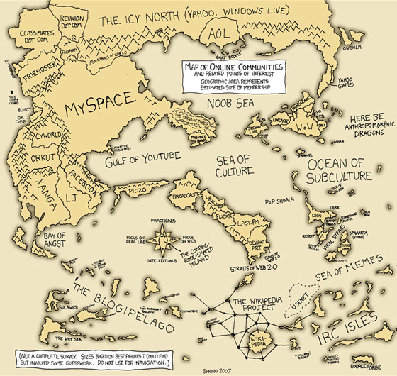
via XKCD
For another take on social networking communities, view Flowtown's 2010 Map of Online Communities