I've always been fascinated by brands and logos. When I was younger I would sit for hours and copy logos, fashion labels, band logos, either by hand with felt pens or on the computer with the early drawing packages like Microsoft Paint and Publisher. It was a natural reaction when met with a blank canvas.
So it comes as no surprise that I find myself all these years later as an artist who not only works very closely with brands to help them convey their ethos through art. Branding is what also drew me into the world of graffiti as an art form.
What attracts me to both brand design and the culture of graffiti is the creative expression behind the concept of identity - sometimes cryptic and blunt, other times outspoken and blatant.
The point at which branding and art connect is where I find my fascination with graffiti. To me, the concept of being your own brand is interesting. Graffiti writers have their own personal logos, standing as brands in their own right, with trademark graphic styles, repeated over and over. Instead of glossy magazine pages, their canvases are the walls of the train lines. If you have the courage, you have the opportunity.
Graffiti always seemed to me a purer form of the concept of 'brand identity' and one that came with real artistic flair, mystery, energy and danger. What traditionally set graffiti artists and brands apart was the drive for something beyond financial gain. However, in a world where this concept of personal brand is very much a part of modern life, is this changing? And if so what effect does this have on the work that is produced as a result?
I've recently worked on a couple of projects with Acrylicize that address the idea of identity and branding through art installations that set about posing questions about the very nature of where commerce and art start and stop.
Graffiti is fashionable at the moment - this much is true. However, its acceptance as a celebrated art form by the commercial world has surely had an influence on its evolution, challenging writers to go somewhere new with the work and cross over into other areas.
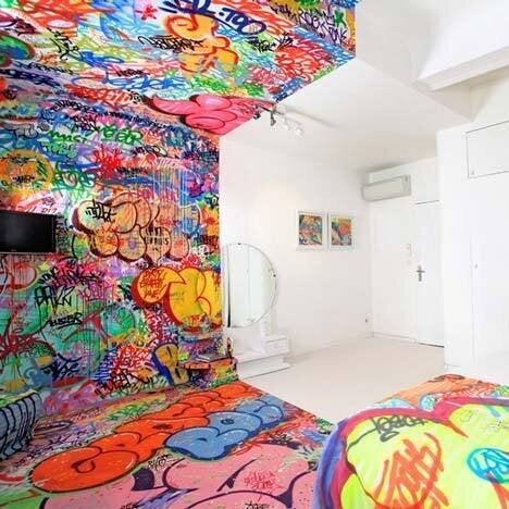
Take the Au Vieux Panier hotel in Marseille, brought to the art world's attention by internationally renowned graffiti artist TILT who took to the walls to create the hotel's aptly named 'Panic Room'. This is interior design inspired by graffiti, commissioned by a hotel chain, whose walls are now covered with TILT's repeated 'logo'. The clean white half of the room cleverly acts as the antidote to the rough, energetic and colourful sprawl of the graffiti landscape. The project begs the question of where the art starts and the design stops. What I like about it is that it takes graffiti to a place it hasn't been before whilst retaining and celebrating its more raw state. In doing so, both the hotel brand and brand TILT both win.

Photo by Big Addict
Taking graffiti somewhere new as a result of a commercial collaboration is what I tried to do when an opportunity to spray the European offices of a well-known search engine came up (ironically I can't mention their name). Not wanting to create some blatant corporate propaganda or a brand-heavy piece of work, I decided to go cryptic and use the idea of 'search' as the main concept for the piece. With the help of graffiti artists Tizer (ID, London) and Zics and Keim (404 Error, Paris) we created a giant wordsearch using the theme of diversity to rock as many styles as we could.
The idea was to create work that addressed graffiti's struggle with its newfound corporate popularity and the purist objection to anything graffiti-led being attached to commercial purposes. In doing so the brand aspect of both ourselves as graffiti artists and the brand who commissioned the piece were hidden from view, instead weaved covertly into the fabric of the piece. It's there but it takes time to find it. In doing this we created an interactive aspect to the work, which invites the viewer to engage with graffiti in a way they may not have done before.
Approaching art through branding prompted the question - is material, in its basic, branded form already Art? Andy Warhol certainly thought so, taking the humble soup can, for example, from household item to a popular culture icon. This crossover of branding and popular culture seems to create an emotional attachment to design and it is this idea that I was keen to explore. I've always been a huge fan of heritage design and how it returns in under a new spotlight, generations on from its original use
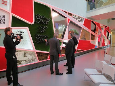
In a completely contrasting project to the graffiti, I got to experiment with overt branding, delving with permission into the archives of mega-brand Heinz to celebrate innovation, ahead of the opening of their European Innovation Centre in The Netherlands.

Photo by James Burke
From original typography on old wooden crates to experimenting with Heinz products themselves, it was a lesson in branding for a brand identity that has stood the test of time. The work was very much a cross over between Art, Design and Brand prompting the question 'when is Art' and further blurring the boundaries between the three disciplines.
While these projects come from very different places - branding with its commercial ends, graffiti as a retort to elitism, establishment and inaccessibility to art - there is something in questioning the roles, similarities and crossovers of art and branding, and the mediums used to tackle it that has produced a new and exciting generation of artworks that, if nothing else, reference the inescapable mass commercial world that surrounds us.
What's your take on corporate branding used as a form of art and adapting existing branded material for artistic purposes?