Recently, I came across an article from Econsultancy that pointed out that only 1 out of the top 20 UK online retailers uses responsive design. To my shock and dismay, the only one using this development method is... Currys. 14 of those retailers have mobile sites but that means they need to develop (and maintain) a separate codebase for each version which is very inefficient from a resources and cost perspective. At Boticca, we've been doing this for months now and have seen some very positive results - I will share some numbers below.
For those of you who don't know, responsive design is a way of designing and coding websites with a fluid layout, so that images and other elements of the site adapt to the screen on which the site is being viewed. To test if a site is built in responsive design, just adjust the size of your browser window to different sizes and see if the layout adjusts accordingly (it seems almost "elastic").
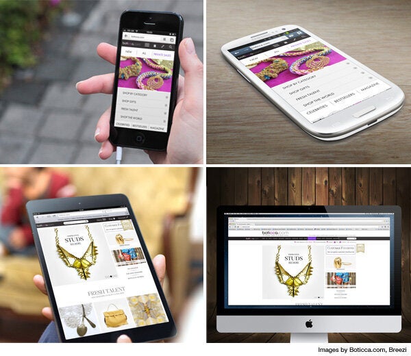
We launched our website in responsive design back in September - below, see screenshots of the same homepage on different devices - before it become the hot topic and were the first global fashion website to do so. Since introducing responsive design, mobile traffic (which includes tablets) has more than doubled in absolute numbers and now accounts for over 30% of our traffic and 25% of our sales, up from 20% and 15% respectively in September.

However, on the flip side, we initially noticed that mobile conversion rates were 40% lower than desktop conversions and the average order value was 10% lower than our site average (£110) - probably because users still prefer using desktops for higher priced purchases such as ladies handbags.
To address this, in the past couple of weeks, we streamlined our checkout on mobile (which is currently the key thing standing in the way of mobile purchases) to make the process faster, with less clicks to buy, and have seen a 25% increase in conversion rates as well as a 12% increase in the average order value. We expect these numbers to increase even further when we introduce one-click buy.
So site owners, with mobile internet users set to outstrip desktop users in 2014, it's time to ditch those ugly mobile sites.
Think mobile-first. Think efficiency. Think responsive.