The issue of living standards has - rightly - risen up the agenda in recent years, following the unprecedented six year-pay squeeze and severe hit to household incomes in the years after the financial crisis of 2008. Yet too little attention is given to the other side of the living standards equation: the cost of living. The pay and income 'rebound' enjoyed by many over recent months owes much to the fact that inflation has been hovering around zero for much of 2015, but things are likely to change rapidly on this front in 2016, increasing the urgency of securing still stronger pay and employment recovery.
Yet even the headline inflation rate tells only part of the story. It is based on an average 'basket' of goods. As such, it masks very different trends in the costs of different commodities. For example, October's overall inflation rate of -0.1% contained both a 14.5% reduction in fuel costs and a 3% increase in rents. The actual inflation experienced by different households depends on their particular profile of spending. And this differs significantly by income, age and location.
Today's annual Family Spending release from the Office for National Statistics contains a wealth of useful information - and the ONS has done a good job of presenting much of that data. Below we set out the Resolution Foundation's five key charts that explain just who spent what in 2014.
1)Unsurprisingly, richer households spend more. On average, the poorest fifth of households spent just over £14,000 last year. In contrast, the richest fifth spent close to £47,000.
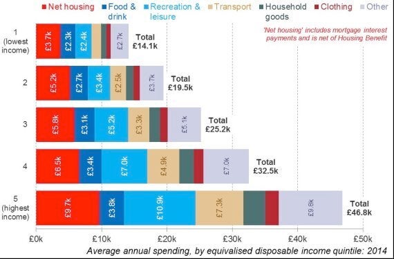
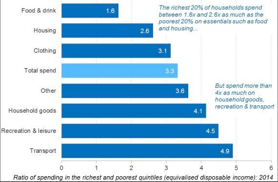
2)While they spend a lot more, the richest fifth of households spend a lot less relative to the poorest fifth than we might expect. Their incomes were more than six times higher last year, but their spending was just 3.3 times greater. And that ratio drops to just 1.6 in relation to spending on food and 2.6 on housing.
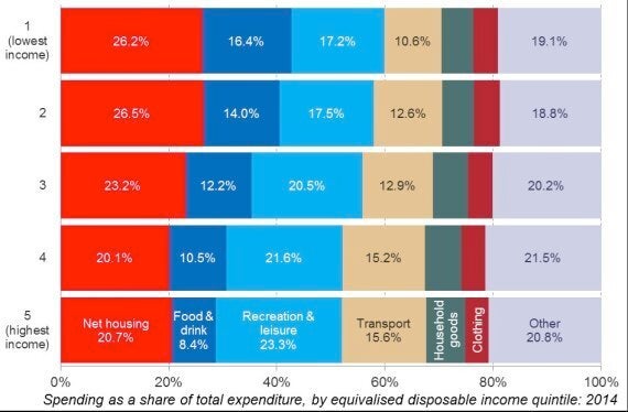
3)Poorer households allocate significantly more of their spending towards essential items. Taken together, food and housing accounted for 43% of all spending among the poorest fifth of households last year. In contrast, the richest fifth of households allocated just 29% of all their spending to these goods. This difference in profile would look even starker if we measured it relative not to overall spending but to income.
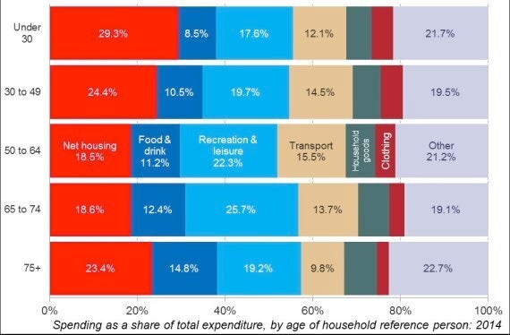
4)Housing costs fall sharply across the age distribution. Nearly £3 of every £10 spent by under-30s last year was allocated to housing. In contrast, those aged 50-74 directed less than £2 in every £10 towards housing.
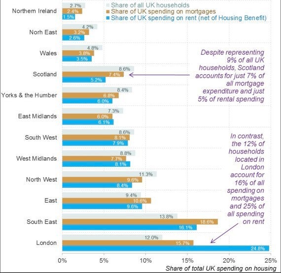
5)Housing pressures are most acute in London. London rents were 70% above the UK average in 2014, while mortgage costs were 45% higher. Higher costs and the disproportionate number of renters in the capital mean that London accounted for one-quarter (25%) of all UK rental payments last year and 16% of mortgage expenditure, despite only representing 12% of all UK households.
The spending of the different groups set out in these five charts matters considerably for our understanding of living standards. Over the last decade or so, much of the inflation recorded in the UK has been driven by increases in food, fuel and housing costs - compounding the pressures faced by lower income households who allocate a higher share of their spending to such essentials. That's the thinking underpinning the recommendation contained in the Johnson Review of consumer price statistics, that the ONS should set out differential inflation measures for different households.
Recognising such differences will be key to identifying just how the proceeds of economic recovery are shared in the coming years. Importantly, this approach should also offer clues as to how policy makers can drive improvements on both sides of the living standards equation.
