Technological capacity for producing graphics has mushroomed in recent years, and the consequences are obvious across all the media. Every newspaper, television bulletin and website tries to wow us with clever illustrations of their key messages, which are increasingly being called "infographics". But do they help, or are they simply pretty, meaningless pictures?
When I was a young scientist in the 1980s, every illustration and graph that we used had to be drawn by hand, using special pens and stencils, sometimes taking days just to produce one figure. Then they would photographed and printed, or turned into slides. No possibilities for last minute changes to presentations! I'm glad we've moved on from that - but have we moved on too far?
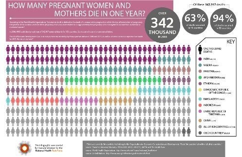
To take one current example, the Maternal Health Task Force (a great organisation that seeks to highlight the tragedy of too many women dying in pregnancy and childbirth around the world) has just produced this infographic

(which can be seen in full detail here).
It tries to make the point that 63% of deaths related to pregnancy occur in just 10 of the world's countries. That is a fact, sourced from the United Nations, as the infographic makes clear. So far, so good. But what I can reveal, that is not shown anywhere in the infographic, is that the 10 countries concerned (India, Nigeria, Pakistan, Afghanistan, Ethiopia, Democratic Republic of the Congo, Bangladesh, Indonesia, Tanzania and China) actually contain 52% of the world's women of reproductive age. Does it hugely surprise you that 63% of pregnancy-related deaths occur among 52% of those at risk? Probably not - it only represents a slightly elevated risk.
So does that infographic convey important information to you about the pressing problems of maternal mortality? In which regions of the world does it indicate that the problem is most severe? Which women are most at risk? Unfortunately the concept of "country" really gets in the way here. There are no rules about what a country should be - so they can be vast or tiny, crowded or empty, rich or poor. Perhaps it would be more interesting to try and look at maternal mortality without letting countries get in the way?

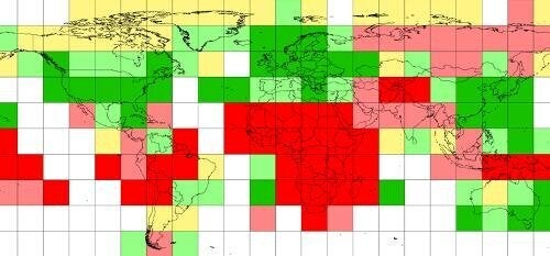
This is an illustration from a more detailed report that can be downloaded here.
It estimates the density of maternal mortality on a purely geographical basis - where the bright red squares represent the highest risks, and the bright green the lowest risks, irrespective of country. It clearly shows that the major problem area for maternal mortality is Africa - again, perhaps not a big surprise, but a lot more informative than simply showing that the largest number of deaths occur in highly populated countries.
Perhaps infographics should come with a bit of a health warning? Even though most graphics probably don't set out to deceive, it is so easy to let the clever technology get in the way of the message that is meant to be conveyed. Sometimes less is more.
