You need to make a chart for your bosses. It needs to be just right: it has to communicate the message correctly in order to get your bosses to make the correct decision. But - wait - you're a data visualization novice. Oh no! How do you know you're going to make the right chart for the job?
What kind of chart should I use? Should I use an interactive dashboard? A story? A static image? Might a table of numbers be just the thing I need? Should I print it, or put it on a screen and talk about it?
For people new to the field, people going beyond Excel's defaults for the first time, it can be a daunting prospect to be visualizing data for others to consume. Many of you will, rightly, seek help from experts. We turn for help to the experts. These may be colleagues, bloggers, or authors. How can you be sure you can trust their answer?
I have one simple test you can apply to be sure they know their stuff. Whichever of the questions above you ask, the only answer an expert should give is this:
"It depends."
All visualizations are a compromise. There are no hard and fast rules in data visualization (except maybe the one that says "never make a 3D pie chart"). At best there are guidelines. Experts are those who have learnt enough to know what those guidelines are and when they can be broken.
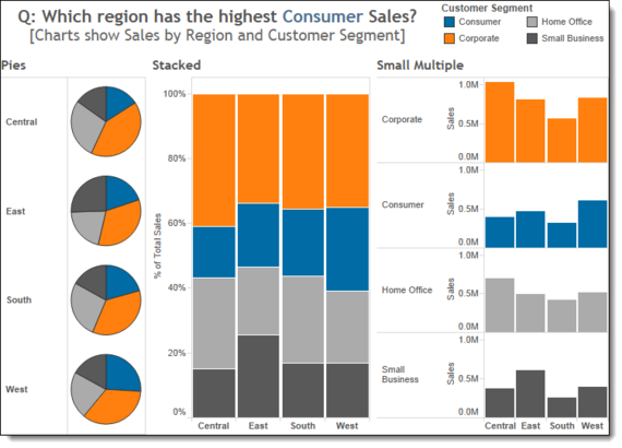
What does the right answer depend on? Primarily it is to do with the purpose of the chart. A pie chart with a few segments will be good for showing a part-to-whole relationship, but no good for showing the actual values. Bar charts will show you an amount very effectively, but they're no good for getting a sense of the percentage value. So you try a stacked bar chart. Now you've got a problem around familiarity: stacked bars aren't something everyone's seen. If people don't understand that chart, they won't engage with it. And so you continue down a seemingly endless path of decisions. For every chart you create, there will be one or more reasons it doesn't work. The image below shows an example.

Choosing a chart type is hard enough, and your resident expert's answer, "it depends", should inspire you to consider which aspect of the data is most important? The actual value? The perecentage of the whole? Or something else? This example has just two categories (Region and Customer Segment) and one value (Sales). Imagine how hard it gets when you want to bring in more data.
That's not all, though. Your chart choice needs to be based on many other factors.
Who is your audience? Do they know the data inside out? Do they want to explore the data for themselves? Are you trying to provide an operational view of your data, or put across a very strong message to drive change?
I'll focus on one of these: audience.
If you are producing charts for the public, or for an internal audience who might not look at charts too often, you will have to produce charts that engage users. This means sticking to familiar chart types. It might even mean you need to add some "bling" to the chart in order to make the chart more attractive. Data visualization purists may scoff at that but if nobody reads your chart, then why bother making it?
On the other hand, if you are producing operational dashboards for managers in your organization, you'll probably lean towards simpler, possibly more "boring" chart types. Bar charts are very effective, but stand accused by many of being boring. Your operations manager, though, wants something he or she can glance at, daily, and identify issues in an instant.
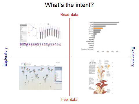
Andy Kirk, of VisualisingData.com, summarises the challenge extremely well in his Intent Quadrant:

The balance between reading/feeling data and exploring/explaining is very important. The reality is more complex as we've seen. Even when you know which quadrant you are designing for, there are many more decisions to make.
"It depends" is not a sign of experts ducking your question, it's a challenge to you to consider the purpose and context of your work first.
For your own work, this may seem initially intimidating, but it's best to give each piece of work your best shot. Each time you share work you will see the response it gets. Over time, you too can become an expert, with a better understanding of what works. You too can ultimately get to answer any question on data visualization with the wise answer:
"It depends."
