An effective chart can answer many questions, but it can never answer all questions. It might answer the exact question the chart designer wanted to answer, but even the most astute designer cannot control his or her audience. A curious audience will read a chart and, with luck, come up with new questions.
These in turn create new answers and, over time, the communal audience of these progressive charts becomes wiser.
Let me show you an example.
You may be familiar with Gapminder, the organization setup by Hans Rosling. Gapminder seeks to"unveil the beauty of statistics for a fact-based world view". Hans Rosling's TED talks are rightly some of the most watched of all time.
Gapminder makes their data available for download. This gives us the ability to be use their charts as starting points for conversations.
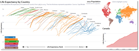
Adam McCann (@adammeccan), inspired by a chart from the New York Times, downloaded Gapminder data to see the data in a new way: to focus on global life expectancy trends.

In his chart it is easy to see that all countries are, overall, experiencing an increase in life expectancy. The discrepancy between the top and bottom ranked countries is also very clear.
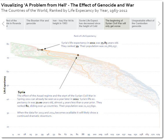
Nelson Davis (http://thevizioneer.blogspot.co.uk) downloaded Adam's view to explore it himself. It'shere that the power of data-based conversations begins to emerge.
He wanted to know: "What would cause a large decrease in life expectancy rapidly?" As he found out, the sobering answer is genocide and war.

Whereas Adam's focus had been purely about life expectancy, Nelson was adding to the conversation by bringing in other focusses for the data. He told a story with his data, focusing each section on a particular country or pair of countries.
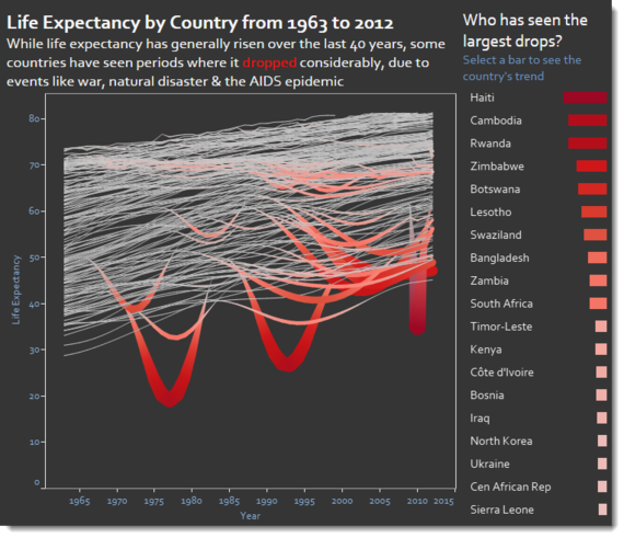
A day later, Michael Mixon joined the fray. Michael appreciated the story Nelson was telling but wanted to further develop Nelson's chart: how can you see which countries have experienced the sharpest declines in life expectancy in the same view?
He played with the data and sketched out ideas to achieve his goal (sidenote: it's always a good idea to break from your screen and play with some pencil and paper). His end result emphasizes the countries that have seen the worst impacts on life expectancy.

Each of the three views develops the conversation, using the same dataset. Adam showed countries ranked by life expectancy. Nelson told a story, focusing each frame on a different country and its experiences of war or genocide. Michael showed us all the countries where there have been considerable drops in life expectancy. Each author learnt something new about the world through playing with, and reworking, others' charts. These learnings were passed onto those who read the charts.
One dataset. Three views. One conversation with multiple talking points.
This should be our communal goal with all data visualization. Humans are social creatures. We learn through conversations. Our opinions sway and change with the ebb and flow of these conversations. Imagine being able to have this conversation with data. We needn't be content with one static chart or one interactive dashboard; we should start with a chart that asks a question and evokes a response.
Share it with colleagues. When those responding repivot your original chart and further the conversation, we will achieve the goals of Gapminder: "to unveil the beauty of statistics for a fact-based world view".
