Weather Reporters Donned This Striped Pattern On Thursday For A Good Reason

You might have spotted it on ties, mugs and pins.
HuffPost's own environment reporter Chris D'Angelo proudly owns a climate change tie based on researcher Ed Hawkins' work.
Chris D'Angelo

If you noticed your local weather reporters dressing like twinsies on Thursday, know that it’s not because they texted each other to coordinate their outfits the night before.

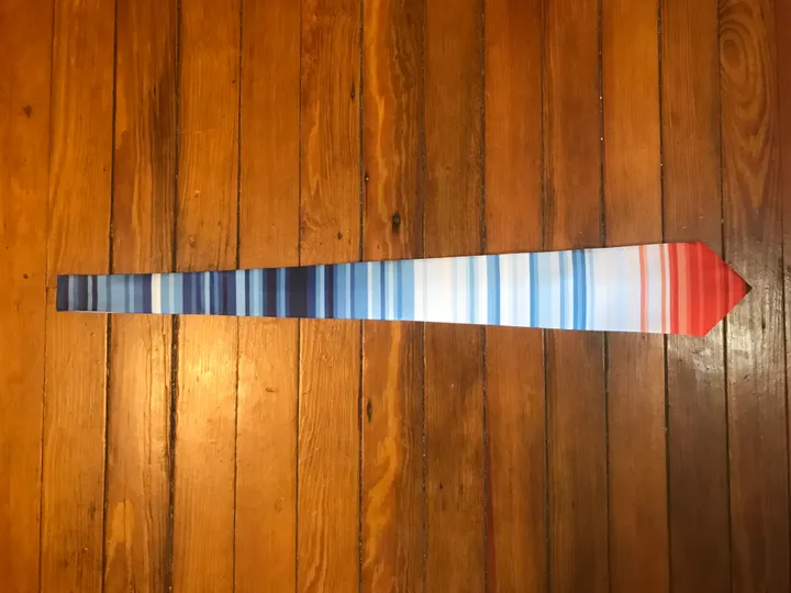
That striped pattern of red, white and blue is actually meant to raise awareness of climate change on the first day of summer.

It’s a particularly timely stunt, too, considering the contiguous United States just had its warmest May on record, the NASA scientist who sounded the alarm on climate change 30 years ago just told us we’re failing “miserably” at doing something about it, and a group of Republican senators just attacked the National Science Foundation’s grant program as “climate propaganda.”

Amazing response to #MetsUnite - lots of meteorologists discussing climate change today while wearing stripey ties, earrings & necklaces (available here: https://t.co/mcjRLPgyOg).@WeatherProf has done a great job organising! Summary: https://t.co/gGuLKNSP8S pic.twitter.com/xgA0F1jCxT

— Ed Hawkins (@ed_hawkins) June 21, 2018

The pattern was created by Ed Hawkins, a climate researcher at the U.K.’s University of Reading, as a way to visualize the Earth’s rising average temperature from 1850 through 2017. Cooler years are represented by blue tones, with white for normal temperatures and red tones for the hottest years.

It’s easy to see the overall trend with just a glance: The planet is getting warmer.

“This visualization removes all the distractions of standard graphs and allows the viewer to just see the long-term trends and variations in temperature without needing to interpret anything else,” Hawkins told The Washington Post last month.

After seeing Hawkins’ work, Jeff Berardelli, a meteorologist for a local CBS affiliate in Florida, was inspired to organize an event using the hashtag #MetsUnite.

In addition to one global average, Hawkins created several regional versions to illustrate temperature trends in the contiguous U.S., England and Toronto. (More, he says, are coming soon.)

The design is available from Zazzle on ties, mugs, pins and other items. Local meteorologists took time away from their green screens across the country on Thursday to explain their looks:

You may see this a lot on your feed today. This "warming stripes" design was created @ed_hawkins. It shows the average global temperature from 1850 to 2017. The earth IS getting hotter #MetsUnite @WeatherProf pic.twitter.com/SsH1Pk8bo9

— Lauren Olesky (@LoleskyWX) June 21, 2018

Joining together with broadcast meteorologists across the country today as part of #metsunite

The stripes indicate the temperature anomaly for Earth since 1850. The trend is clear. The earth is warming. No politics. No agenda. Just science. @WeatherProf @ed_hawkins pic.twitter.com/olM9S2qwZO

— Chris Michaels (@WSLS_Michaels) June 21, 2018

Happy #summer! Hot summer days increasing in SpringMO since 1970 & we’re not alone. My necklace shows global temp trend from 1850, mix of blues turns red hot in recent decades. Thanks @ed_hawkins for the visual & @WeatherProf for nerdiest necklace ever! #MetsUnite #ClimateMatters pic.twitter.com/aff0SJV7jY

— Elisa Raffa (@Elisa_Raffa) June 21, 2018

#MetsUnite on this first day of summer to recognize that climate change is real. It’s not about politics, it’s about science. Each stripe on this coffee mug shows global temperatures since 1850. (cc: @WeatherProf) pic.twitter.com/BrNZH0cqsc

— KXAN Weather (@KXAN_Weather) June 21, 2018

This pin represents global temperatures over the last 150 years, from top to to bottom. #Climatechange is very real. Today, #MetsUnite across the country by wearing this pattern to spread awareness. Thanks to @ed_hawkins for designing & @WeatherProf for getting the word out! pic.twitter.com/IrRDQ6ToRF

— Geoff Bansen (@WeatherGeoff) June 21, 2018

You may see these stripes today for the #solstice. They represent @ed_hawkins visualization of the global temperature from 1850-2017. Notice how the blues fluctuate hues and then transition to orange and then dark orange, representing warming trend. #metsunite #climatematters pic.twitter.com/imDtW3W1mj

— Maureen McCann (@MaureenMcCann13) June 21, 2018

I’m wearing an unusual tie today. It represents the change in temperatures across the globe from 1850 to 2017. It’s a part of a nationwide initiative called #MetsUnite to bring awareness to the increase in global temperatures. pic.twitter.com/C7EsLO5rNW

— Alex Puckett (@Puckettwx) June 21, 2018

What's a great way to show off a visual of our warming planet? Through a tie! Great visualization from @ed_hawkins #MetsUnite @ClimateCentral pic.twitter.com/DOsY3wpD4B

— Matt Daniel (@mattdanielwx) June 21, 2018
Close

What's Hot