Google has announced a minor - but significant - redesign of its homepage and logo.
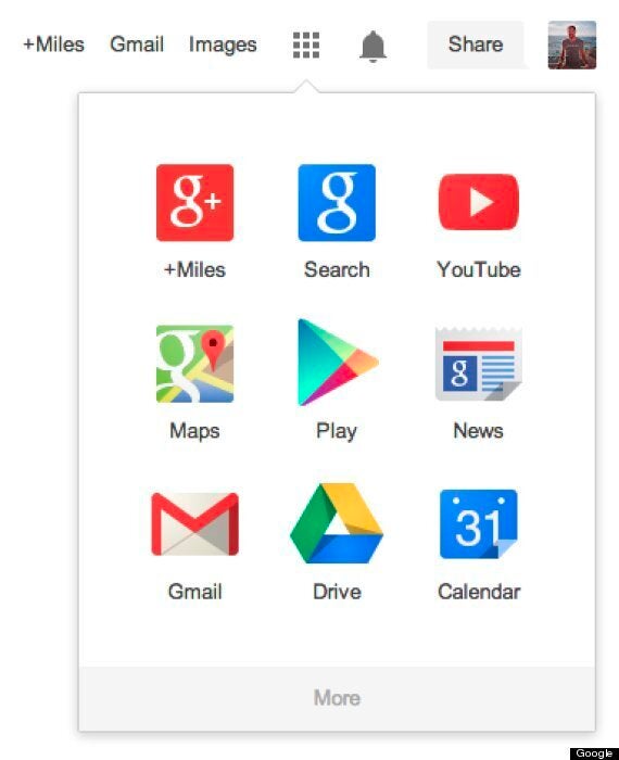
By some measures, Google.com is the most visited address in the world. But the search giant has thrown caution to the wind, and is rolling out a subtly new version of the site which includes a new logo and an Android-style app launcher.
The design removes the black navigation bar currently seen at the top of the site. Instead it replaces it with a cleaner white version, and a icon resembling a grid of dots which is used to pull up a menu of its different apps.

It also switches the current rounded 3D-effect logo for one which is flatter, and has more muted colours.
Google said that the redesign would roll out slowly to its millions of users, and that it was intended to "streamline" the use of its services.
The redesign is the first permanent change to the logo since 2010.
In a blog post Google said: "We've also refined the color palette and letter shapes of the Google logo. We'll be rolling out this update across most Google products over the next few weeks, so keep an eye out and let us know your thoughts."