Are you making a 'Where's Wally' puzzle of your data analysis? At first, this might not seem like an obvious question to ask, but think about it. The challenge and enjoyment offered by Martin Handford's puzzles stem from scanning intricate images, being visually tripped up by puns and tricks, whilst painstakingly searching for 'Wally'. Looking for data in a spreadsheet, a vast set of rows and numbers, is a lot like searching for 'Wally'. What are the lessons we can learn?
There's a reason why 'Where's Wally' is so effective and enduringly popular. The human brain is evolved to use colour, shapes and patterns as catalysts for cognitive recognition. These originally enabled us to spot threats in the environment; now they enable us to spot trends and sequences in charts more easily. 'Where's Wally' puzzles play havoc with this ability. They confuse the mind by making everything in the images a similar size, colour and shape. The only way to find Wally is to look closely at every element.
In Wally's world this is fun but in the world of data analysis this approach is time-consuming and hugely frustrating. What's surprising is that in our working lives, spreadsheets and poorly designed charts make 'Where's Wally' puzzles out of data. This is not an approach that is conducive to making quick and informed business decisions. Have those analysing spreadsheets in offices forgotten to factor in the simple facts of human evolution dictating how our minds work? Given the option of finding insight in a spreadsheet or an engaging and creative graphic, which one would you choose? I know which I'd prefer!
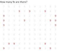
Let's think of our insightful data as 'Wally' himself. How could we make him easier to find in row after row of uniformity? If the background was made a light grey, and only Wally was bright red, he'd pop right out of the page. Along similar lines, imagine for a moment a grid of numbers, all in black and in an unvarying layout. How long would it take you to identify the number of 9s on the grid? It's safe to say that it would probably take 5 minutes before you were certain. It would be substantially easier and quicker if the 9s were in a different colour. In both cases contrasting colour acts as a differentiator.


Colour is one of several preattentive attributes that aid the efficient understanding of information. Length, size and shape are also excellent for making important numbers or themes stand out to our brains. Imagine a conventional spreadsheet displaying figures for business profit and loss. The truth is that there's really no need to conduct a 'Where's Wally' search of each individual number in order to draw useful conclusions.
Data visualisation tools can be deployed to use these attributes in order to transform uniformity into an eye-catching image enabling users to find the important values. Learning and applying the rules of preattentive attributes is simple, and good visualisation tools can leave our brains to metaphorically sign with relief as a result! Remember, 'Where's Wally' confuses us because there are so many similar characteristics combined.
Data visualisation software provides analytics tools that liberate users to transform complicated, monotonous data spreadsheets into effective visual representations. Users can display data in a manner that our visual system can quickly interpret. Why make a 'Where's Wally' puzzle out of your data analysis when a more visually enlightening alternative is available to all? Visualisations designed with the visual system in mind are catalysts to quick business decisions, a creative communication of ideas and a liberation of data trends!
