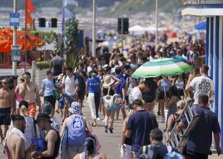
As the temperature continues to climb to new height in the UK, a conspiracy theory on social media is started to spiral.
Various accounts claim that the colour in weather maps have been altered in recent years to inspire greater fear in the public, through more intimidating colours.
Here’s why there’s no truth in it.
What’s the claim?
Social media posts comparing two different weather maps, supposedly taken years apart, have been widely shared by users claiming the way meteorologists talk about weather has become more dramatic.
Most posts include an “old school weather” forecast where the UK land is all in the same neutral colour, with small suns replicated across the country to indicate heat and sunshine.
The main indication that the climate might be uncomfortable is in the colour of the temperatures recorded in different regions – cooler weather is placed in a yellow box, while hotter temperatures displayed in an orange box.
A screenshot supposedly showing the UK media’s coverage of the current heatwave looks quite different, with the temperatures in degrees displayed in white boxes.
The land itself looks more like a heat map, with a dark red colour showing extreme highs, and yellow to indicate lower temperatures.
Crucially, both images are supposed to show how the UK covers similar temperatures ranging from mid-teens to mid 30s.
The post has been replicated by other users and widely spread on the internet.
The real explanation behind the two images
The Met Office’s Aidan McGivern, who helped to create the new temperature colour scale, explained the real reason behind the change in a Twitter thread.
He said it was therefore clear that posts were doctored (although he later said the image on the right was actually from a single Met Office tweet dating back to 2016).
While the Met Office did redesign its graphics earlier this year, changing the map view, temperature symbols and colour scale, the image on the right has been changed to exaggerate the dark red.
He also said that even before this change, record-breaking temperatures were still shown through bright reds and oranges – unlike the image on the left.
He also explained that the colour scale has bene changed for “accessibility reasons” to help colour blind people distinguish between different colours by changes in gradient.
McGivern explained that the darker reds correspond to temperatures in excess of the UK temperature record, the record being 38.7C in 2019.
These shades were also only ever intended for the hottest parts of the world – like the Sahara.
“I never imagined I’d end up seeing them in the UK. The doctored image has those darker reds on it but with much lower temperatures written on the map, which is why it looks like the image was faked,” he told The Independent.
He also clarified that the map goes darker when it gets colder as well, as people who are colour blind find it easier to see variations in light and dark rather than hue.
McGivern said the “happy sunshiny maps” are still used on social media as well, but that the Met Office usually uses data-driven maps rather than weather symbols with its forecasts.
