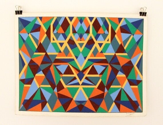
Desmond Rayner's new show, titled Major Minis, currently held at the Piper Gallery in Fitzrovia, London, is an invitation to loose and to find yourself at the same time exploring his intricate drawings. Rayner main interest is to entertain the viewer and as he says: "to hear the melody".

Stop and Go by Desmond Rayner
The works - ink and gouache on paper, all in small size - explore mesmerising patterns, both in monochrome and bright, sugary pastels. Every colour used is completely unique and mixed by the artist. In one work, Four Seasons, there are as many as 32 different colours, the subtleties in the softly changing shades are juxtaposed against the sharp precision of the unyielding horizontal lines.
Self-contained, these works are disciplined yet creative, free yet restrained, they lead the eye somewhere and yet nowhere. Meticulously hand-drawn lines playfully lead the eye across the paper's surface, transforming into polygonal shapes and voids that, like a kaleidoscope, pulsate and shift. This playful energy, at times accelerated with injections of colour or slowed around winding curves, is never realised, or satiated - like the anticipated end of a maze that has no centre, the puzzle never resolves itself. In Weird and Wonderful and Ball and Socket the game only ends when the viewers' gaze is broken.
Rayner talks of his intentions to entertain:
"...there is no reason why shape for its own sake, linked to form and colour, should not be presented for sheer pleasure. The sensation of dry sand trickling through idle fingers is a delightful sensation, but has no useful end in itself. The subconscious wagging of a foot to a half heard melody is relaxing without being productive. It is on this level that the geometrics on show today are intended to be enjoyed".
After a trip to New York in the 80s, architecture - in particular Art Deco - became a prominent influence, alongside an enjoyment of the mental freedom afforded by mathematics, patterns and abstraction. Stop and Go and the acid green Open Spaces both attest to the artist's statement, 'I like colour for its own sake. I enjoy juggling with space.' Rayner has no formal artistic training - a course in technical drawing encouraged a logical and methodical approach to space. Paradoxically, imaginative freedom is triggered by his accurate, disciplined lines and the brain finds unexpected relief within the patterns.
Megan Piper, the curator and gallery director, kindly agreed to respond to the following questions:
1. Why did you decide to invite Desmond to exhibit in your gallery?
Des is an artist who has sustained his studio practice for over four decades and his bold abstracts caught my attention from the first time I saw them. I included a number of his early works in a group show, New Possibilities: Abstract Paintings from the Seventies, in November 2012. This year he returned to abstract painting, on a smaller scale, and as I've watched the series take shape and form a strong, coherent body of work - I knew that I wanted to show them as a collection.

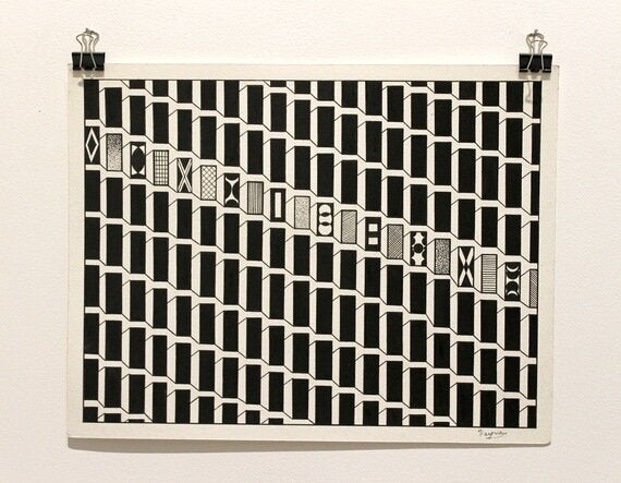
Light and Dark by Desmond Rayner
2. What is your favourite work? And why?
Light and Dark. It has such strong architectural references and reminds me of the facade of a Barbican high-rise (the Barbican, incidentally, had a solo exhibition of his work in 1983). There is something deceptively simple about this work. I like that the grid is broken by what appears to be a row of windows that are also individual, smaller paintings.
Desmond Rayner, the artist, also agreed to respond to the following questions:
1. You mentioned architecture as being one your main influences. Are there any other influences? Why?
I have a great interest Art Deco (rather than architecture in general) and homed in on these buildings on a trip to New York - I'm fascinated by the clean lines. I've always admired the colours in Kandinsky's work - he was a great colourist.
2. Although you want the audience to enjoy just the shapes and colours for their own sake, you give a great importance to the titles. Can you please let us know why?
The titles encapsulate the work in as few words as possible. I consider them an integral part of the work. In a way they are an abbreviation, or perhaps an extension of the piece itself and point the viewer in the right direction.
3. Do you see each work as a microworld? if so, can you expand on that?
No, not in any way. This is the sense of pretension that I am against. The title of the series, Major Minis, is important as it explains how I see the works - 'major' in so far as they contain a lot of detail, 'mini' by virtue of the fact that they are small. I want each individual to see what they feel they can see.
Another show, curently being exhibited at the gallery, titled The Edge of Painting, curated by Tess Jaray, which explores new approaches to painting and with artists like: Martin Creed, Cornelia Parker and Cathy de Monchaux is unmissable. It is one of the most interesting and well-curated group shows I have seen for months. Both exhibitions, which ends on the 30th of December, are highly recommended.