As a designer and creative, I love working on a diverse range of projects. And in my role as the Creative Designer at Pret A Manger, I certainly got my wish, working on projects from campaigns to coffee cups, in UK stores and around the world. So when it comes to my own brand, variety is equally as important.
Back in 2011, I launched my self-titled design brand with a range of stain-embroidered napkins and in the same year collaborated with Zizzi and Natasha Law to create the bowls used in their stores nationwide. Both situated around the dinner table setting, but two very different designs. The Zizzi design featured a geometric bird sitting on a branch and was one of my widest reaching designs at the time. So five years later, I wanted to take a second look, and see how this one-off design could be the starting point of a complete range. And here's the result.

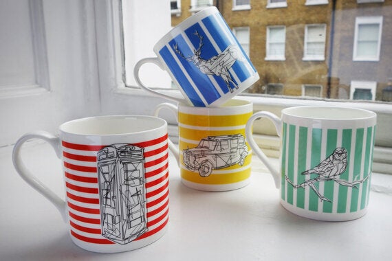
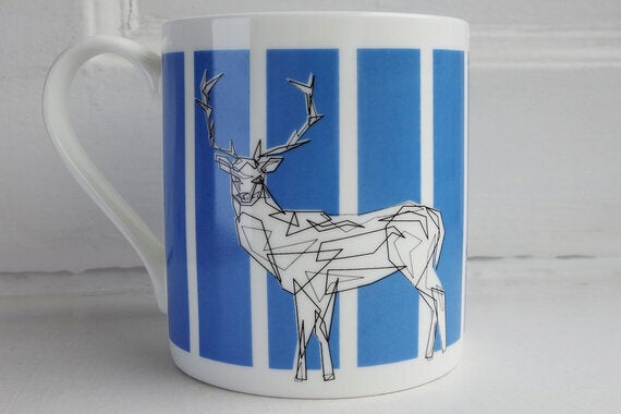
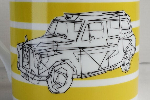
The new designs see four subjects that might be seen as twee, transformed into a much more contemporary reincarnation - the same vision as five years ago. This time I opened up the brief to both country and city life, choosing two icons from each - a bird, deer, red telephone box and black cab. I initially wondered to myself about the amount of times these had been featured in designs and how I could make my version different. I began by taking each one back to basics. I converted the forms into abstract shapes, with no curves or joining of the dots, just separate entities that would come together to create the intended object. In the wildlife, I looked for character in the face to bring a charm into the work that might at first seem cold. In the man-made objects, I used the shapes to give a texture and gradient in what was in fact a very flat print. I enjoy attempting work that challenges, and I find that on the road of achieving specified goals, the work often finds new life and opportunities.

The aim was to create a range of four designs that work together, but equally have the strength to stand alone. Apart from the cohesive style in the forms, the background lines grow in a uniform way - doubling, tripling and quadrupling - from the telephone box to the deer. As the main images embrace the simplicity of black, I wanted a considered vibrancy to come through in the background. The colour selection was an important process, attaining my vision of the perfect blues and reds, and how they would be produced on the bone china itself. I love the quality and feel of the material, and matched with the design, there is a real harmony between the elements.
When designing for the home, I know it's a very personal space and see it as huge privilege when my designs are invited into this setting. This range is a true tale of my aesthetic, being a fusion of old and new. It's a concept that I think you warm to very instantly, yet offers up more intricacy the more you live and use it. I always ask myself, would these products sit in my kitchen, and I can honestly say yes - in fact they already do. They have been five years in the making, and most importantly, they hold a great cup of tea.

The bone china collection will be launched at the Richard Brownlie-Marshall Pop-up at West Elm, Tottenham Court Road, London. 11th & 12th June 2016.
For more information this and other designs please see www.playrich.co.uk