I was in high school when I first decided that design would be my destination, but my GPS must have been on the blink, because the exact area of design was undetermined. Today, I'm no closer to finding the exact location I fit into, but I have discovered that it's something that doesn't need to be found.
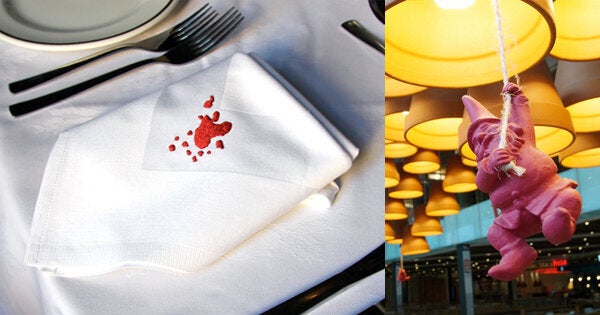
It would be safe to say I've had an unconventional career - from producing theatre, creating lettuce underwear and selling stained napkins. Back in high school I never could have even fathomed the range of opportunities I would encounter, so by not limiting myself, my aspirations could be limitless. It was in my current role as Head of Creative for Tossed, that I was first immersed into the amazing world of food retail. It's quick paced, high volumes and short timelines: and it's exactly the fire that lights up my creative spirit. So much so, that around 6 months ago, when I was approached to design the brand of a new healthy grill concept, I was certainly up for the challenge.
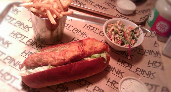
The brand was Hot Pink and it's first branch opened in Wimbledon this week. When designing a brand package there are a lot of elements to take into consideration, and no matter what people say about books and their covers, a company will be judged purely on appearance. In line with all my design work, I aim to have a result that is instantly impactful, but with a deeper story for those who choose to delve further. For this logo I took inspiration from cattle branding to demonstrate tradition, neon lighting that's associated with new york steak houses and mixed it with the bold style of contemporary London eateries. The result is Hot Pink - a brand that speaks for itself.
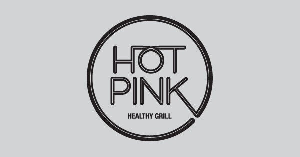
Designing the logo in black works to keep a boldness that attributes an iconic nature to make it stand out in the marketplace. There are also many practical reasons, including printing, where it can keep costs down by allowing single-colour print processes. I was also tasked with designing the menu layout, where I wanted to push what was expected by demonstrating the items through icons.
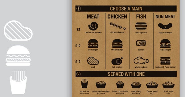
With a very simple menu offering, I wanted to keep the design simple too, and avoid a standard text-heavy layout. I developed a house style of iconography for each item and placed it in a grid structure with the aim of making the customer's decision process as enjoyable as possible. Printing these in black, again gives a boldness to the layout, with the brown paper giving a wonderfully natural texture.
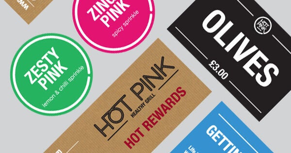
With these main items in place, I could then continue on to create everything from the restaurant storefront to signs for the toilet doors. With the finished product now up and running, I think the project has been a very successful one and a brand I am very proud of. I liken the experience of designing a brand to being similar to that of a child moving out of the house for the first time. You spend time nurturing it and helping it grow into something that will eventually stand on it's own two feet. The design is now out of my hands, or should I say fish fingers, but I'm very excited to see what the future holds for this hot concept.
